

Credence for cliché color combos
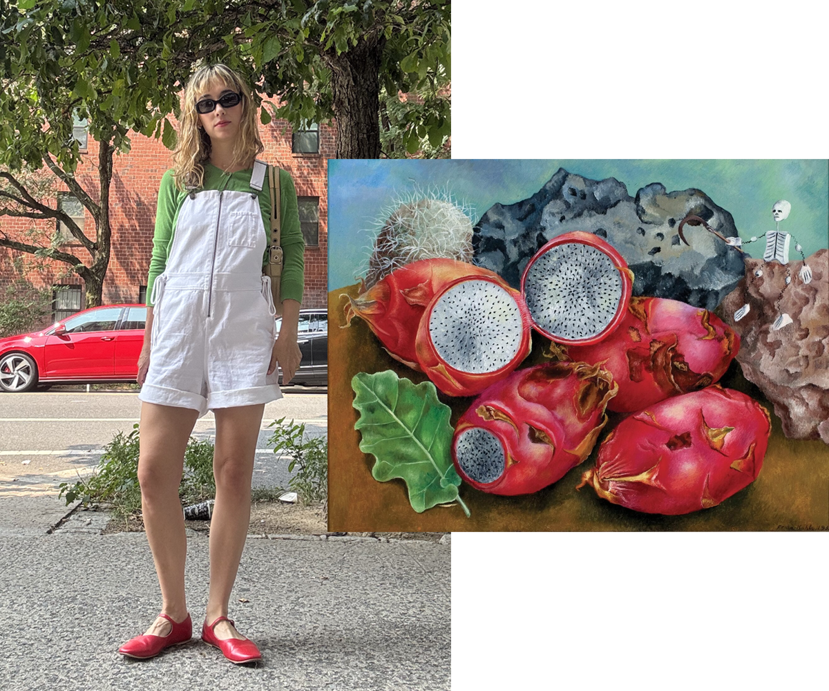
I dressed in four "no no" color schemes, using various works of art as inspiration , resulting in a hearty stamp of approval for heretofore off-limits chromatic mixes

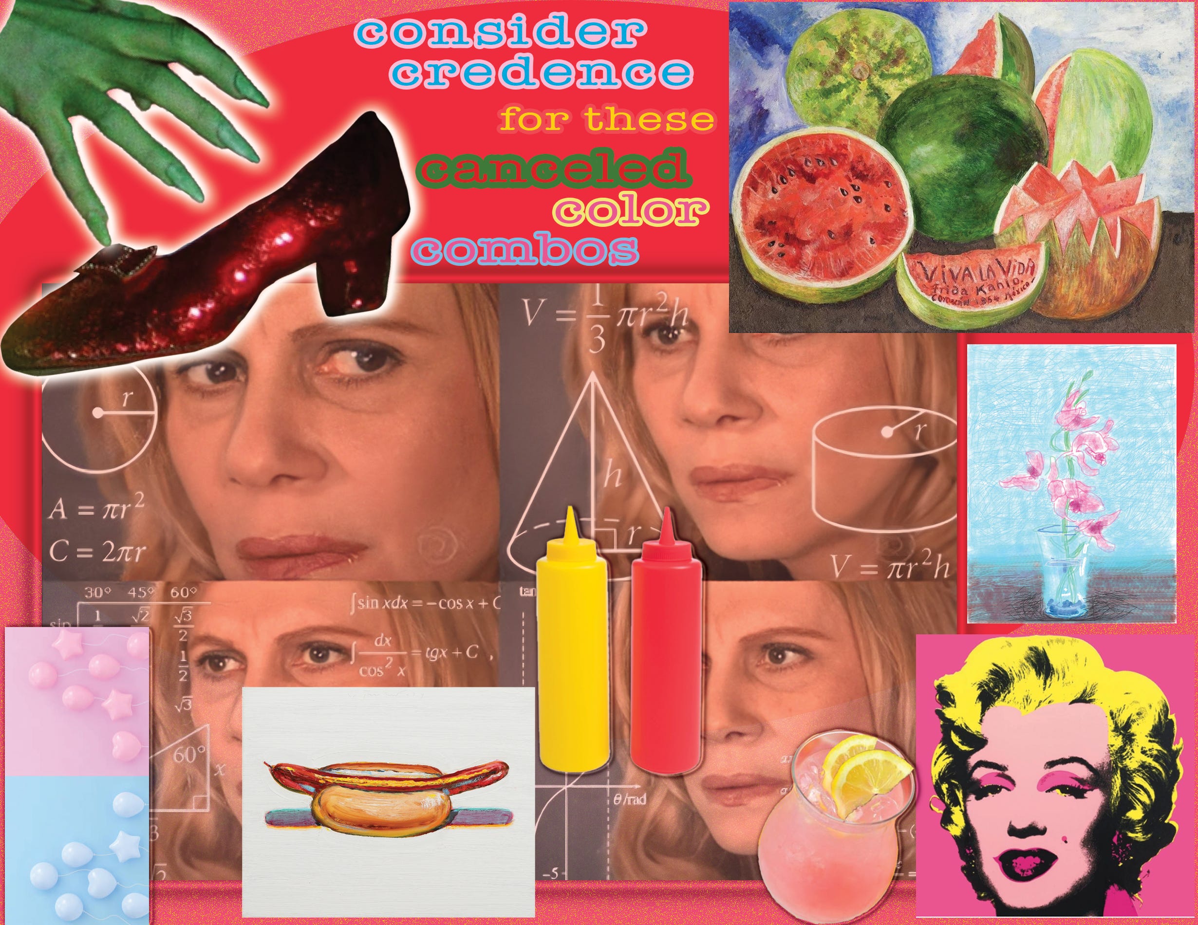
Color combine outside the lines
A sentence directed at me that starts with “you look like [insert insulting remark masquerading as ‘just an observation’”] has always filled me with dread, because it’s guaranteed to be a boring and/or lame conclusion drawn by the speaker about my outfit (not to mention it’s entirely reductive to personal style). As a person with a history in “adventurous” dressing, I have long been the receiver of “you look like _______” comments. The first outfit dig of memory I have is from elementary school, when an evil gay told me I looked like Pepto Bismol in reference to a gingham ensemble I wore of all pink and white (the audacity)!
When it comes to hearing people’s hot takes—more like lukewarm takes, hardy-har—on what I wear, I’ve formed a thick skin. My unperturbed attitude toward those attempting to fashion police me has grown particularly strong when the comments pertain to color combinations. I mean, there’s a reason certain colors are used alongside each other in the first place: because they look good together! And there are only eleven “colors” when it comes down to it: white, black, red, orange, yellow, green, blue, purple, brown & grey—so I’m not going to let a holiday or national flag take a great shade coupling/throupling away from me (case-by-case dependent, of course). Go ahead and tell me I look like the Italian/Mexican/Hungarian/Lebanese/Bulgarian/Iranian, etc., etc. flag when I wear red/white/green bc why would igaf (you see my point)?
To start with a fresh color perspective this post, I’ve turned to works of art for tints, tones, & tinges inspiration. I’ve chosen paintings—instead of clothing, flags, sports teams or daily life associations—for references in an attempt to rewire my/our automatic reactions to seeing color combinations that are deemed faux pas everywhere but artistically. And since it’s high summer after all, the color schemes are hot-weather themed.
Red & Green (Watermelon) 🍉
It goes without saying that wearing red and green together is generally canceled in any setting other than Christmas. But to repeat my previous point: these colors are complementary, aka they look great together. Beyond their complementary nature, red & green occur together year-round in nature; and in summer of course the two hues sit alongside each other in the quintessential watermelon, a fruit containing uniquely hard-to-beat shades of both red and green, as far as wearability. Also, there has never been a more pertinent time to represent watermelon colors and wear red, white, green and black together because Free Palestine!
Frida Kahlo’s famous watermelons painting is classic to the point of having been mimicked and printed everywhere. For my own incentive, I wanted a less ubiquitous work of art so I inquired within by asking my art friend Caity (yes, the very same recent bride for whom I designed a wedding dress) for intel. And Caity delivered by sharing another of Kahlo’s paintings, depicting watermelon-colored fruit of the cactus variety in a work from 1938 entitled Still Life: Pitahayas. This piece was created by Frida when she was thirty-one and was made by oil on aluminum; both traditional materials used in Mexico for religious altar paintings. Read more about Kahlo’s alluring painting on the Madison Museum of Contemporary Art’s site.
Keep reading with a 7-day free trial
Subscribe to CRACD: Clothing Recs & Advice from a Clothing Designer to keep reading this post and get 7 days of free access to the full post archives.